“Red color, Red color,
Where are you?
Here I am, here I am,
How do you do?”
Since it’s about colors, the introductory part had to be peculiar. At times, colors may appear as features of our ways of life. They, in fact, paint the entire universe. But is it just a matter of color, or do they have a different essence? The answer may surprise you since certain colors can induce particular behaviors and perceptions. Besides, not every brain in the world may perceive color in the same way. Isn’t this interesting? And like that, the mystery box of the colors starts to fascinate us even more. Amazed? Paul Gauguin, a French artist, once asked, “Color! What a deep and mysterious language, the language of dreams.”
What if they could communicate with us? And if they even try that, then how to know? Well, the psychology of color is on the way that seeks to figure out how color influences our daily choices, emotions etc. In fact, Carl Jung, a prominent Swiss psychiatrist, once quoted, “Colors are the mother tongue of the subconscious.” Interestingly, this adds a lot of value to today’s marketing strategy and so forth.
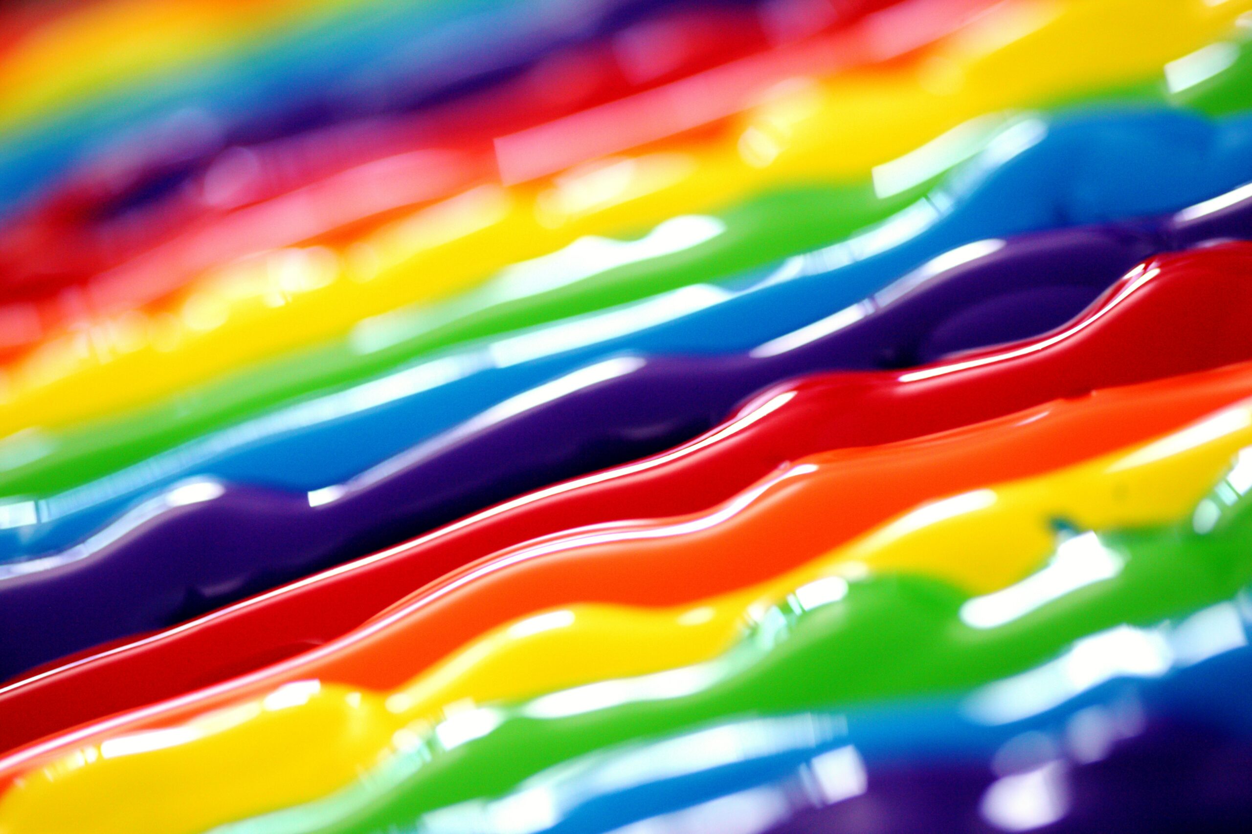
If color may serve as a form of non-verbal communication, then what do you think your favorite color is trying to convey? Want to know? There are millions of known and unknown colors with various shades. For now, let’s hold onto our traditional rainbow colors and find out what they’re trying to depict.
Illustration of Red
“Don’t talk. I just see red.” Or, “You’re being red!” I bet many people can relate these scenarios if they’ve ever had a tantrum or are baffled with shyness. Again, you may notice many brands or shops use ‘OPEN’/ ‘CLOSED’/ ‘ORDER HERE’ or may be the play button of a video or audios on a red card. In color psychology, red stands for one of the intensive and warm colors which is energizing. It elicits strong emotions. It can increase your appetite in one way while also triggering a risk in another. It’s almost as if the color red prepares us to take action in some way. You may have encountered many brand logos where red is quite a dominant colour.
Illustration of Orange
Orange is one of the close companions of red. It radiates a sense of optimism, creativity, and new ideas in our usual life. Moreover, orange induces a sense of urgency. That’s why, many brands use an orange card with their logo of ‘limited edition.’. The color orange adds a bit of fun to frames making it hard to take you seriously. So, let’s use it carefully.
Illustration of Yellow
“More sunshine. More yellow. More sunflowers. More laughter.” We can paint a beautiful picture in the back of our heads. Yellow is a cheerful color that radiates energy of the summer. It evokes feelings of joy, positivity as well as deception and warning. Likewise, it also could mean that you’re an extrovert and intellectual who’s drawn to the new and modern, when your favorite color is yellow. It also portrays the feeling of friendship, optimism and individuality.
Illustration of Green
Green is one of the prime colors of the planet. We’re aware of its resemblance to youth, aren’t we? It seems to draw the energy of nature, flourishing, rebirth and prosperity from which its loveliness arises. Moreover, it depicts a harmonious balance between the head and the heart. And this gets aligned with restfulness that is positively associated with the springtime exterior and environment. Moreover, it depicts the balance between the head and the heart creating harmony along with restfulness associated positively with the exterior and the environment of springtime. Can you feel it?
Illustration of Blue
Hearing the word “blue”, even if out of the blue, might remind us of the vast sky. Or we may think of a screenplay in which we’re sitting in the sand to watch the soft blue waves wash us offshore. Isn’t that a lovely imagination? Blue, thus, transcends somewhat peace, calmness, loyalty, integrity and teleports us to a dreamy realm. And you might be grounded or thoughtful if blue is your favorite color. Conversely, it may also make you seem like a cold-shouldered person.
Illustration of Indigo
Indigo seems to be quite a tricky color. Can’t call it properly purple, blue doesn’t sound right either. Yet interestingly, in the ‘new age,’ it appears to be the color of insight and perception that are beneficial in opening the third eye. It promotes deep concentration during times of introspection, yoga or meditation, helping you achieve a greater sense of consciousness.
Illustration of Violet
While violet appears to be a delicate color, its softness, richness, royalty, and saturation are powerful and command attention. It sparks the picture of a colorful life which stimulates minds and creativity. The color violet may tempt us to channel our creativity into some fantastic dreams! So, if we ever need an escape from the harsh reality, let’s use this color. And you might find yourself in a fantasy world. Who knows!
So, there you have it: some amusing facts about our rainbow colors, even if they’re perceived differently by different people. So, did you get the answer to your favorite color? Let us know whether they really match up.